Skate Like a Girl Website Redesign
UI Design, Figma Prototype
2025, class project
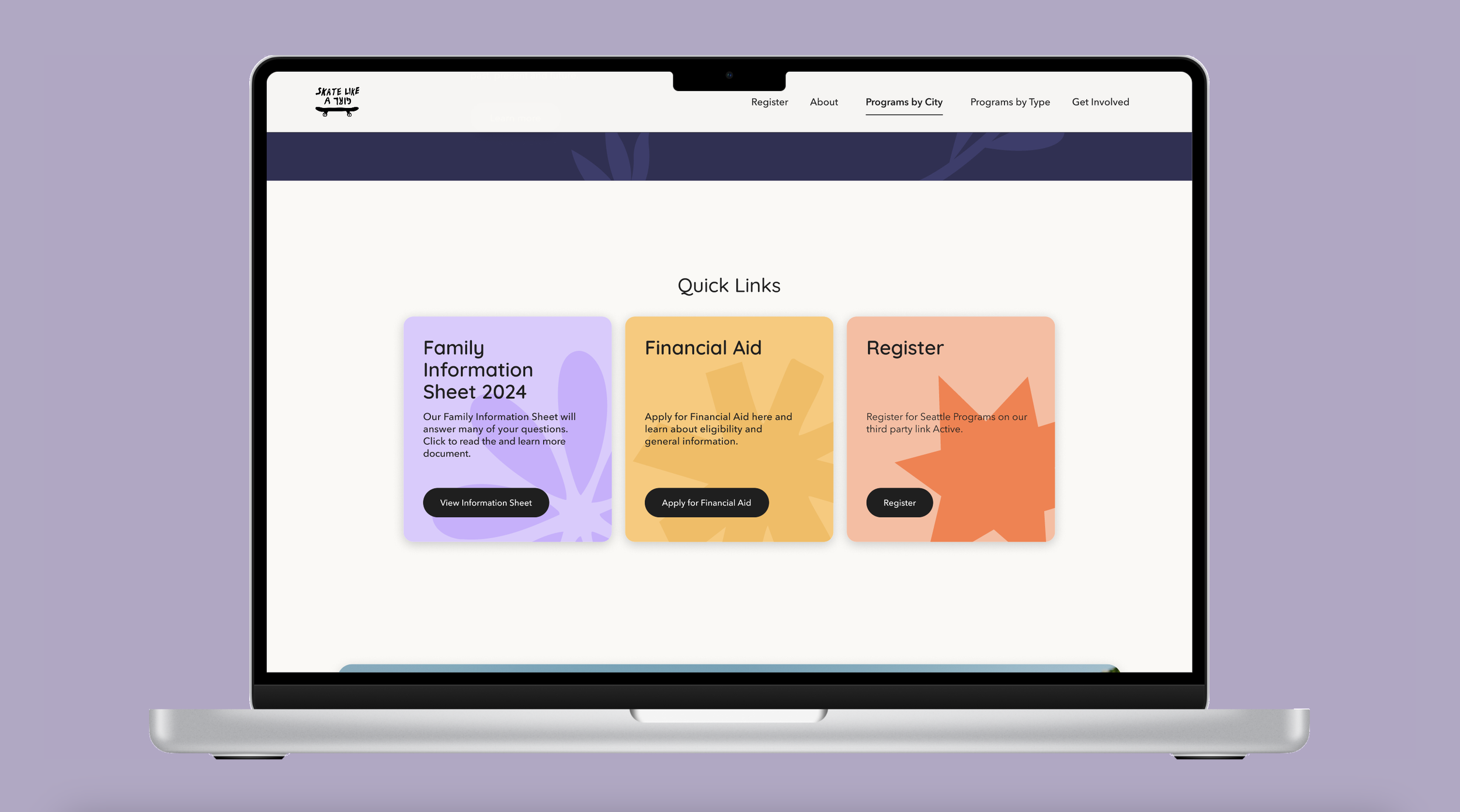
Redesigning Skate Like a Girl’s desktop website using Figma to create the wireframes, mockups, and prototype.


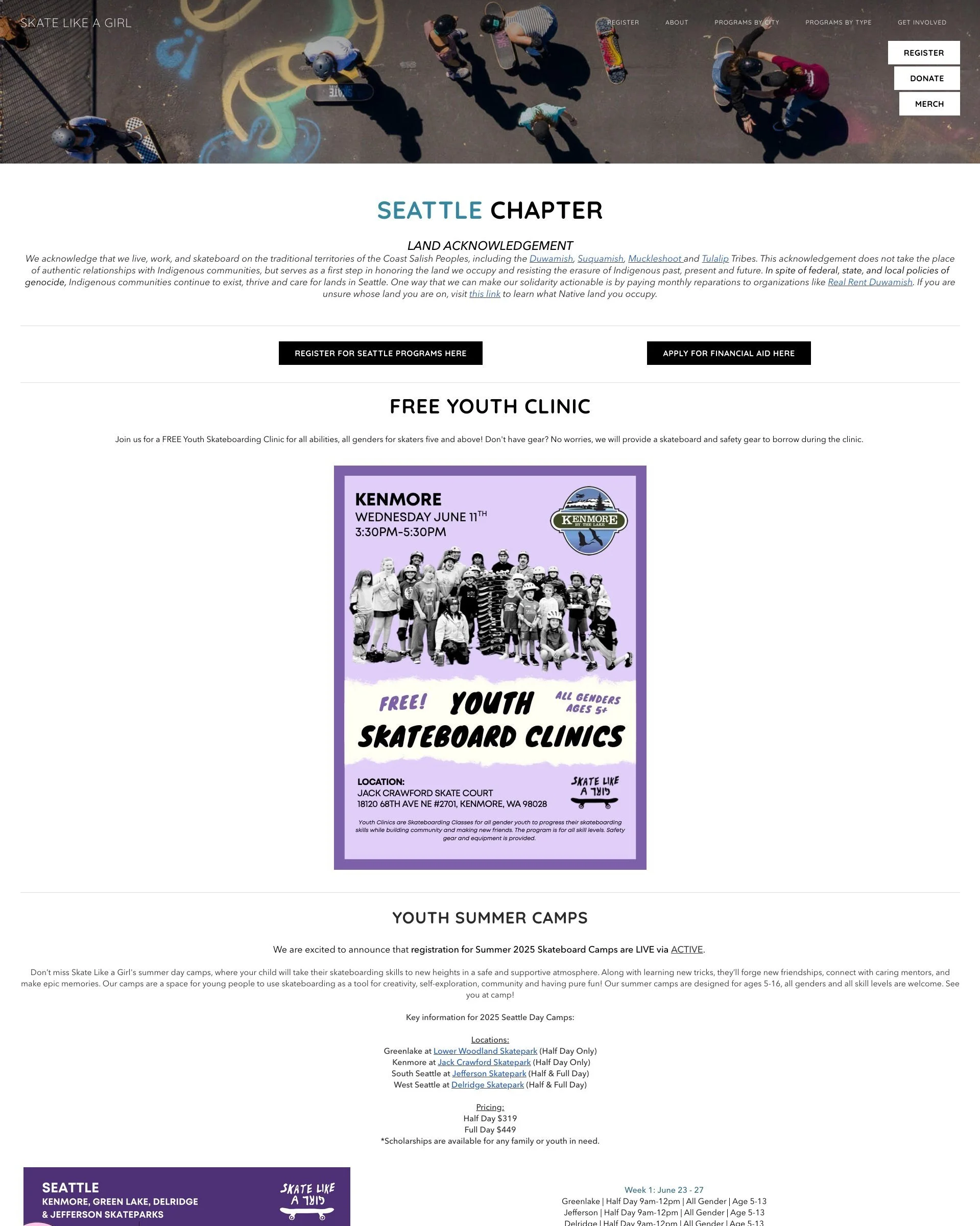
Before: Seattle Chapter Home Page
Problems: Hierarchy, Layout, Typography
The Seattle Chapter and its main call to actions (Register, Apply for Financial Aid) are separated
The single column Land Acknowledgement body paragraph is too long to be center aligned and needs to be broken down into two columns for easier readability.
The two buttons below the Land Acknowledgement section “Register” and “Apply for Financial Aid” are off centered, and the Register button is repeated.
The placement of the 3 buttons (Register, Donate, Merch) right below the website’s navigation bar adds clutter to the header.

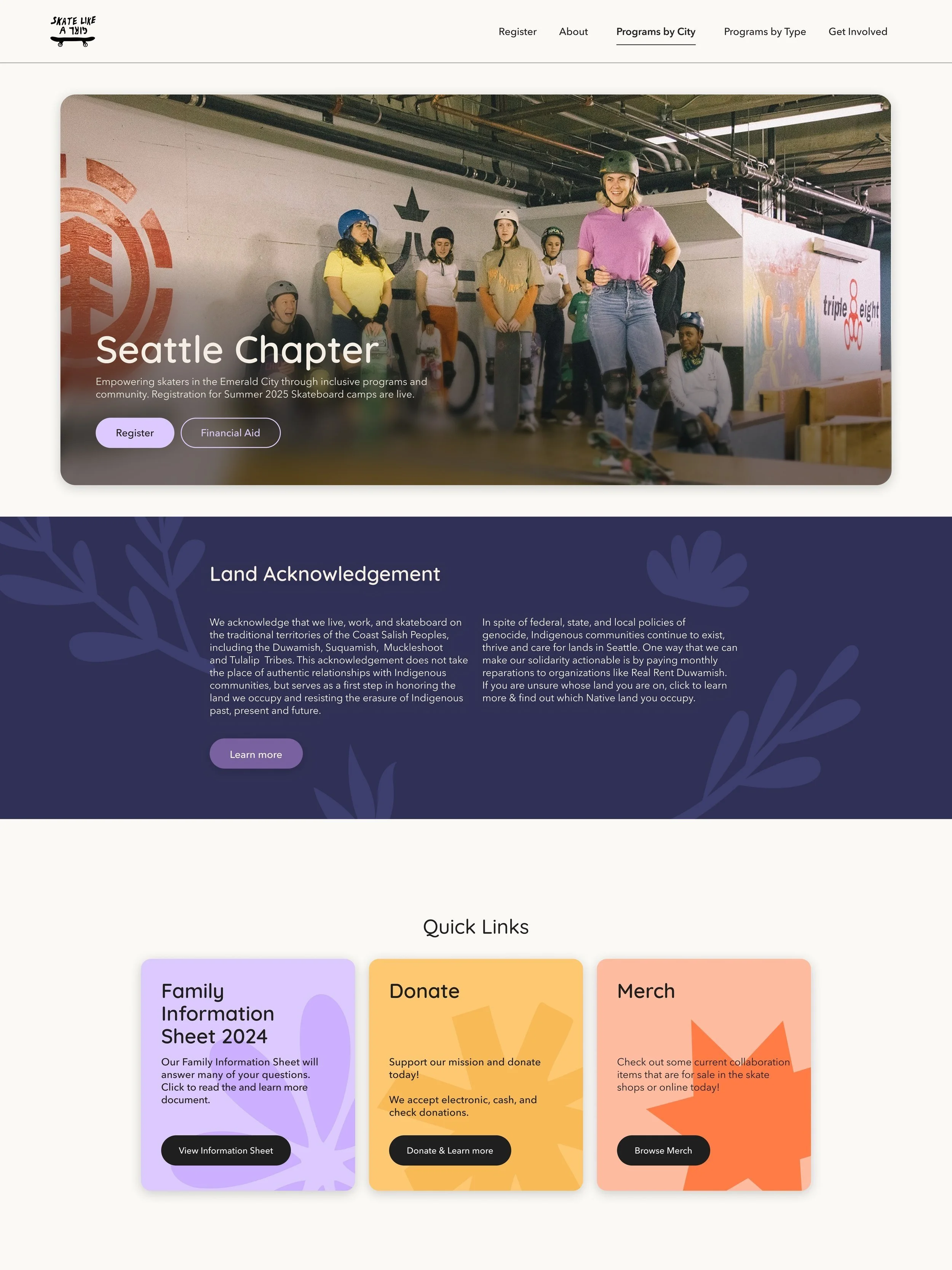
After: Seattle Chapter Home Page Redesign
Solution
Replaced the header image photo as the main hero image within a UI Card that states the chapter’s location, mission statement, and main call to actions “Register” and “Financial Aid”
Created a separate section directly below the Hero image dedicated to the Land Acknowledgement statement
Moved the 3 buttons that used to be under the navigation bar into a separate Quick Links section. I chose not to include the Register button since it’s already provided on the Hero image.
Instead, I included a Family Information Sheet that answers frequently asked questions


